View
Drag


It's tempting to chase the latest website design trends. Think neumorphism, auto-playing background videos or minimalist hero sections with cryptic phrases in Helvetica Neue. However, once the initial allure fades, a critical question emerges: is this website actually generating revenue?
Often, designs driven by trends prioritize a modern aesthetic over practical functionality. This can result in slow loading times, hidden calls to action and confused visitors who ultimately leave without converting. The key difference between a visually appealing design and one that effectively motivates users to act lies in revenue-focused design.
A website can look modern and still fail miserably. We’ve worked with clients who spent thousands on sleek animations, bold color schemes and oversized hero text that says absolutely nothing. Visitors land on the homepage, pause for three seconds and leave because they can’t figure out what the business actually does.
The irony? While many websites prioritize a clean aesthetic, this often comes at the cost of clarity and, ultimately, conversion. A visually appealing site that fails to clearly communicate its value is akin to a shop with no sign. It may catch some attention, but it won't attract customers. Trendy design elements like minimal navigation, oversized fonts or endless scrolling might impress other designers, but customers are primarily looking for quick answers. If your website's layout requires them to put in too much effort, you risk losing the sale.
A revenue-focused design captures attention and then guides it. It prioritizes fast loading times, clear communication and an effortless user experience.
A website's primary goal is conversion, not accolades. Every design element, color, layout, typography and motion must contribute to this purpose. Your homepage functions as an elevator pitch. If visitors cannot quickly understand who you are, what you offer and why you are the best choice within ten seconds, then your design is negatively impacting your revenue.
We emphasize to our clients that a website being modern is only a compliment if it also performs. Striking visuals, however stunning, can become a distraction rather than an asset if forms malfunction or calls to action are overlooked. The most effective websites achieve a balance between aesthetic appeal and strategic purpose. They selectively incorporate design trends that enhance the user experience, discarding any that serve only as superficial embellishments.
While design trends can be beneficial, particularly when they improve usability or reinforce brand identity, they become detrimental when used as quick fixes for appearing current. For instance, half of the modern websites we evaluate feature impressive hero videos that hinder conversions due to slow loading times. Similarly, some sites sacrifice valuable content in pursuit of minimalism, failing to establish trust with visitors. Ultimately, while form and function should ideally work together, function must always take precedence.

Your website is often the first impression a potential customer has of your business. A visually appealing site is important, but if it's confusing to navigate, visitors won't stay. Effective design guides users seamlessly to their next step, creating a frictionless experience. This is the key difference between websites that simply look good and those that generate revenue.
At Hierographx, we prioritize both aesthetics and strategy. While visuals attract users, our underlying strategy keeps them engaged. We meticulously focus on hierarchy, messaging and flow, ensuring every element works together to encourage clicks, calls or purchases. We understand that trends are fleeting, but a well-structured website provides lasting results.
A beautiful website that fails to generate calls, bookings or sales indicates a design flaw, not a lack of traffic.
🤓Look at your heatmaps. Are users seeing your CTA or scrolling past it?
🧐 Audit your copy. Does it explain what you do in plain language?
🤔 Ask: what’s the next step I want someone to take and is my design making it obvious?
Occasionally, yes, but only when they improve usability. Trends that increase engagement or accessibility can lift conversions. But looks alone don’t rank or sell.
Clarity, load speed, messaging and user experience. If those aren’t nailed, no amount of design polish will help.
Start with structure. Once your site loads fast and flows naturally, then layer in modern visuals that enhance, not distract from, your story.
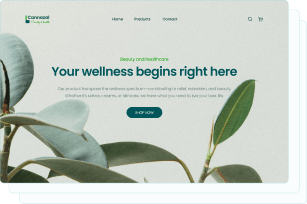
Captivate your audience and enhance brand perception with our custom website design services, creating an unforgettable digital experience.

Captivate your audience and enhance brand perception with our custom website design services, creating an unforgettable digital experience.