View
Drag


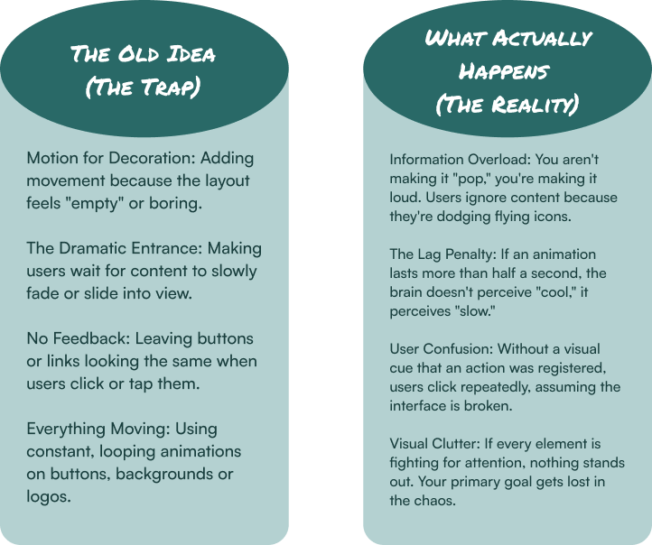
Most designers treat motion like a fireworks show. They want flares, sparks and grand entrances to make the page "pop." But if your users are squinting at their screens or clicking the same button four times because they aren't sure it worked, your fireworks are just a distraction.
In the world of high-performance UX/UI design, the most effective motion is the kind you barely notice. We're talking about micro-animations: the tiny, functional movements that happen in response to a user's action, like a button that subtly depresses when clicked or a toggle switch that slides from gray to green. They are the digital handshake; a silent, split-second confirmation that the website is doing exactly what you asked it to do.
The problem? Most businesses treat animation as a performance rather than a utility. If your site feels "dynamic" but your conversion rates are stagnant, you've fallen into the trap of decorative fluff.
Before you add another bouncing icon, let's talk about what actually separates a helpful guide from a digital nuisance and how to use intentional motion to turn a clunky interface into a seamless experience.
Modern User Interface (UI) design has shifted away from purely aesthetic choices toward a more functional User Experience (UX). Today's users are experts at tuning out unnecessary movement; they only appreciate animation that helps them, not just decorates the screen.
These animations aren't just for looks; they do real work. They make things clear, give feedback and help people use your site without thinking twice.
When you press a real button, it clicks. Your website should do the same. A button that changes color or shifts slightly when clicked tells the user, "Got it. No need to click again." This simple trick stops confusion and double-clicks.
Jumping instantly to a new page can feel disorienting, like a scene change in a movie with no context. A smooth slide or fade shows the user where they came from and where they're going.
Need to draw someone's eye to a new notification or an important button? A very gentle pulse or fade-in works better than just making it bigger or brighter. Our brains notice subtle movement, so you can guide attention without being pushy.
Nothing is worse than a blank, frozen screen. A simple, clean loading animation (like a bar that fills or a short, looping graphic) tells the user the site is busy and their wait is almost over. It turns uncertainty into patience.
The Rule: Helpful animations are quick (under half a second), smooth and have a clear job.
These are the animations that get in the way. They're added for show, not for function and they only slow users down and irritate them.
This is when a website takes over your scrolling, making it jump, stutter or move at a weird speed. It immediately makes users feel like they've lost control. If your site fights a user's basic instinct to scroll, they will leave.
When every paragraph, image and icon has to fly, spin or bounce onto the screen before you can read it, you're punishing the user for visiting. People come for your content, not to watch a loading sequence. Let them see it right away.
A logo that never stops bouncing, a button that endlessly shimmers, a background that constantly shifts, this is visual spam. It's distracting and makes it hard for users to focus on what they actually need to do.
Moving your cursor over a menu item shouldn't trigger a mini-explosion of motion that covers the screen. Hover effects should be subtle previews, not chaotic events. If a simple hover causes surprise or confusion, it's working against you.
The Rule: Annoying animations are slow, unnecessary and steal control from the user.
Before deploying any animation, you must pass the Functional Motion Test:
1. Does it serve a clear functional purpose? (Feedback, orientation, focus or status)
2. Is it faster than the cognitive load it alleviates? (Under 500ms, with smooth easing)
3. Does it respect user control? (Does it avoid breaking native scrolling or navigation?)
4. Is it appropriate for repeated viewing? (Will it annoy a user on their 10th visit?)
5. Can it be turned off? (Respecting users with motion sensitivity)
Micro-animations are the seasoning, not the main course. The best UX/UI design uses motion to answer questions the user hasn't even asked yet. When an animation confirms a click or shows where a menu went, it builds an experience that feels like second nature.
If you're tired of digital products that feel like a clunky funhouse, let's talk. At Hierographx, we build ecosystems where every micro-animation has a clear purpose. We believe great design moves with intention, not just with motion.
Captivate your audience and enhance brand perception with our custom website design services, creating an unforgettable digital experience.

Captivate your audience and enhance brand perception with our custom website design services, creating an unforgettable digital experience.