View
Drag

Strive approached us with a blank slate -no logo, no existing brand identity and no specific requirements. Our challenge was to craft a distinctive logo and cohesive brand identity that clearly reflected their services and professionalism, while standing out in the competitive healthcare billing industry.


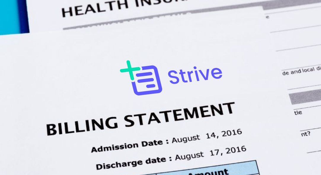
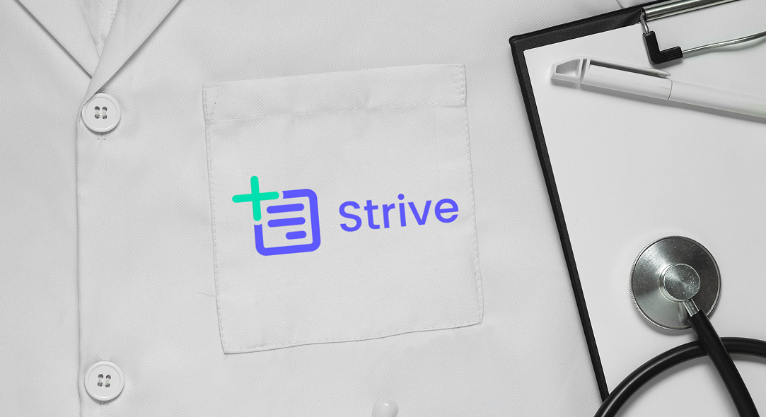
The new logo embodies clarity and precision, reflecting the streamlined, reliable service that Strive provides. We chose a simplified document icon with a plus sign to represent the foundational nature of their work - handling critical billing documents and adding value to their clients' practices.
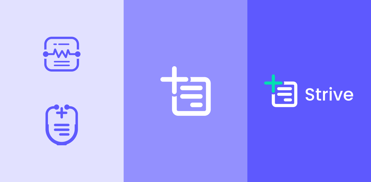
Strive Medical Billing’s brand identity balances professionalism with warmth, using structured iconography and inviting colors to convey trust, precision, and care. Deep blue signals stability, while teal adds energy - reflecting their commitment to providers and positive patient outcomes.