View
Drag

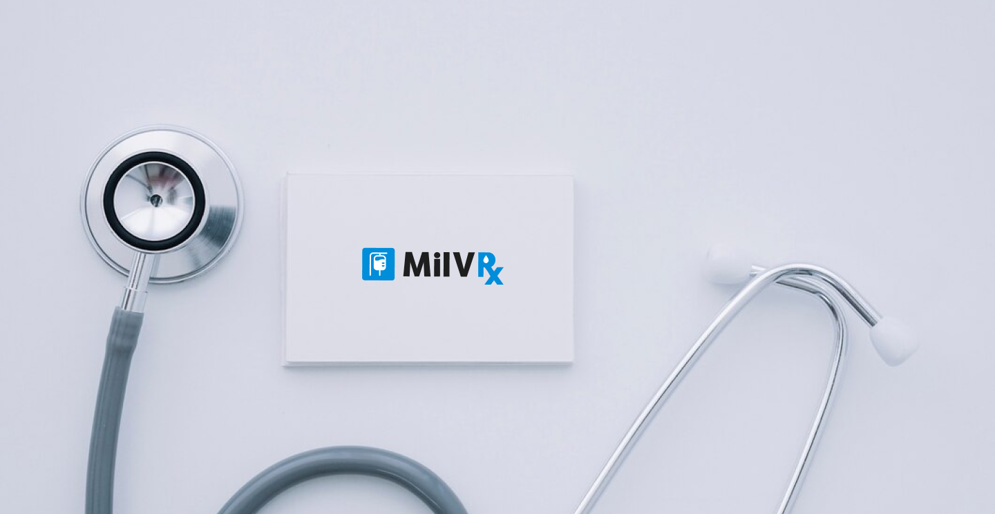
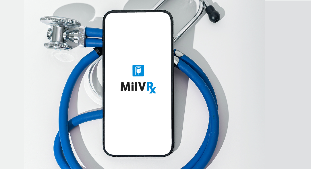
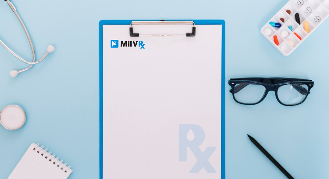
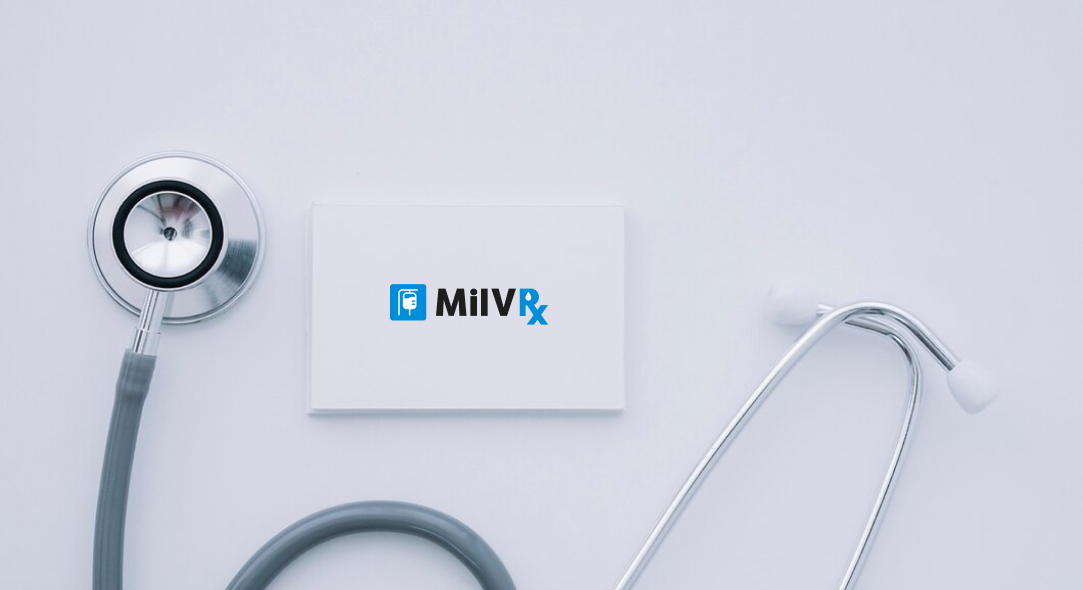
MiIVRx approached us with an outdated logo that failed to capture the unique, specialized nature of their services. The challenge was to create a modern, professional logo that symbolized their expertise in infusion therapy while remaining approachable and clear.


MiIVRx’s visual design is clean, modern and minimal. The IV bag icon and prescription-inspired “Rx” create a strong, recognizable shape. Rounded letterforms and calming blue tones bring softness, while the layout stays balanced and easy to scan.
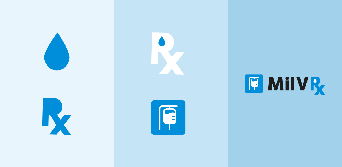
MilVRx’s brand identity emphasizes trust and care through cool tones, minimal icons and accessible typography. Every element was chosen to support clear communication and reinforce the company’s role in patient-focused infusion therapy.