View
Drag


Imagine a world where your website visitors are on a treasure hunt. They're exploring, sifting through information, scanning for those golden nuggets that address their needs or pique their curiosity. Now, you wouldn't want them to get lost in this new world you've created, would you? That's where a game-changing element comes into play - website navigation.
Website navigation has come a long way. Back in the day, it was all about standard drop-down menus, sidebars and footer links. But if you've been paying attention to the latest Michigan web design services trends, you'll notice the bold shift from the old to the modern, intuitive and eye-catching navigation styles.
The magic of website navigation is not just about guiding visitors. It's about crafting a user experience that builds trust, creates an emotional connection and ultimately, converts visitors into customers. So, are you ready to rethink your website navigation?
First, let's talk about the rise of interactive navigation. In the UX universe, interactivity is the new black! Gone are the days when you'd simply click on a menu and navigate through static pages. Now, it's all about interactive elements, animations and dynamic transitions that bring the user journey to life.
The use of hover effects, scroll animations and even elements that respond to the user's movement across the screen are skyrocketing. These create an immersive experience that captivates your visitors and encourages them to explore your site further. Plus, they add a touch of personality that makes your site truly unique.
However, keep in mind that with great power comes great responsibility. Yes, interactive navigation is impressive, but it shouldn't compromise the overall usability of your site. It's all about striking the right balance between functional and fancy.
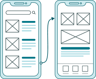
Another interesting trend that has been making waves in the UX sphere is the rise of hamburger and sticky menus. Love them or hate them, they're here to stay. Why, you ask? Because they offer simplicity and convenience wrapped up in a three-line icon or a navigation bar that's always there when you need it.
Hamburger menus are a great way to declutter your site, especially for mobile versions where screen real estate is scarce. They conceal the navigation options and present them to the users only when they're needed. It's like having a magic wardrobe that opens up to a world of possibilities when you want to venture out.
On the other hand, sticky menus, also known as fixed or persistent navigation, are the trusty companions that never leave your side. They remain visible and accessible as users scroll down your page. This way, your visitors have the control to jump from one section to another without having to scroll all the way up.
Now, let's delve into the realm of personalized navigation - the not-so-secret ingredient for a memorable user experience. Personalized navigation designs adapt based on the user's behavior, preferences or past interactions on your site. In a world where "one-size-fits-all" no longer cuts it, it's all about making your visitors feel seen, heard, and valued.
For instance, suppose a visitor has been browsing the "women's clothing" section on your e-commerce site. The next time they visit, you could prioritize these items in the navigation menu, offering a tailored shopping experience. Similarly, for content-heavy sites, highlighting recently viewed articles or topics of interest can make navigation a breeze.
However, it's crucial to ensure that your personalized navigation strategies respect user privacy and are transparent about data usage. At the end of the day, trust and transparency go a long way in building lasting relationships with your website visitors.
We're in the midst of an exciting era where the boundaries of website navigation are continuously being pushed and redefined. With the advent of VR, AR and voice interfaces, who knows what the future holds?
For instance, imagine a website where users navigate using voice commands. Or consider an e-commerce site where customers can try products in a virtual environment before making a purchase. Sounds like sci-fi? Well, these could very well be the realities of tomorrow's UX design.
The key is to stay on top of these trends, experiment with new techniques and continuously optimize your navigation design based on user feedback and analytics.
In an era where smartphones rule the roost, mobile navigation has taken center stage. But mobile navigation isn't just a scaled-down version of its desktop counterpart. It has its unique challenges and opportunities. And if you've got this right, you're already a step ahead in the game.
The essence of mobile navigation is making the most of the limited screen space without compromising on user experience. This means clear, concise labels, prioritizing key features and ensuring that all navigation elements are easily clickable with a thumb. Moreover, it's about providing a consistent experience across all devices. Your user should feel right at home, whether they're browsing your site on a laptop, tablet or smartphone.
A well-crafted mobile navigation can also improve the overall performance of your site. By optimizing images, reducing load times and embracing a mobile-first approach, you'll not only enhance the user experience but also boost your search engine rankings.
Now, let's talk about an often overlooked but crucial aspect of website navigation - visual hierarchy. Visual hierarchy refers to the arrangement or presentation of elements in a way that implies importance. In other words, it influences the order in which the human eye perceives what it sees.
Visual hierarchy in navigation can guide your visitors' attention to the most important elements first. This could be a 'call to action' button, a promotional banner or a new product launch. By using contrasting colors, varying sizes and strategic placements, you can influence how users interact with your site.
Remember, your website navigation isn't just a functional tool. It's a visual cue that can encourage visitors to take a desired action, engage with your content and navigate your site the way you've envisioned.
While we're busy exploring the fascinating world of website navigation, it's also crucial to understand what not to do. Even the most aesthetically pleasing navigation design can fall flat if it doesn't serve its primary purpose - helping users find what they're looking for with ease.
One common pitfall is overcomplicating things. Yes, creativity is essential, but not at the cost of simplicity and usability. Your navigation menu shouldn't feel like a complex maze that leaves your visitors puzzled and frustrated.
Also, avoid generic labels that don't provide clear guidance. Remember, your users are on a treasure hunt, and your navigation labels are the clues. Make them count.
And finally, always have a plan for scalability. As your site grows, so will your navigation needs. Ensure that your navigation design is flexible enough to accommodate new pages, categories or features without becoming unwieldy or cluttered.
In a rapidly evolving digital landscape, reimagining website navigation isn't just a trend. It's a necessity. And with a myriad of innovative tools and techniques at our disposal, there's no limit to what we can achieve.
Remember, at its core, website navigation is about the user. It's about making their journey on your site as seamless, enjoyable and rewarding as possible. And that's where we, at Hierographx, come in.
As a full-service digital agency, we don't just follow trends - we set them. Whether you need a complete website redesign or want to enhance your current navigation, we've got you covered. Connect with Hierographx today and let's start crafting a user experience that sets you apart from the crowd. Because when it comes to innovative Michigan web design services, we're the ones you can trust.
Embrace the innovation, because the future of website navigation is here. And it's more exciting than ever!
Revolutionize your user experience with our industry-leading UX/UI Design service, ensuring a seamless journey for your customers.

Revolutionize your user experience with our industry-leading UX/UI Design service, ensuring a seamless journey for your customers.


