View
Drag


User Experience (UX) reigns supreme as the cornerstone of creating compelling and effective products. While stunning visuals and innovative features may catch the eye, it's the overall experience that often determines a product's success or failure. User-friendly designs aren't just a checklist item; they've become a gold standard, setting apart fleeting trends from enduring digital solutions.
As a prominent web design company in Michigan specializing in UX research, we've witnessed firsthand the profound impact that meticulous UX research can have on molding and refining products. We believe that understanding the user's journey, preferences and pain points is paramount in crafting digital experiences that resonate and endure.
So, why is UX research so pivotal? At its core, UX research demystifies the intricate dance between users and digital interfaces. By delving deep into the interactions, feedback and behaviors of users, researchers can uncover insights that might otherwise go unnoticed. These insights can shed light on unmet needs, areas of friction or even opportunities for innovation.
UX research greatly impacts digital products. Through a blend of observation, user testing and feedback collection, the intricacies of how users interact with and experience products come to light. Such insights have been pivotal in refining and reimagining many of today's most popular platforms.
Every day, millions of users interact with digital platforms, from booking accommodations to streaming their favorite tunes. While the surface experience might seem smooth, there's an intricate dance of design, testing and iteration happening behind the scenes to ensure user satisfaction. In this article, we will delve into two standout examples from companies that epitomize the transformative power of UX research: Airbnb and Spotify.
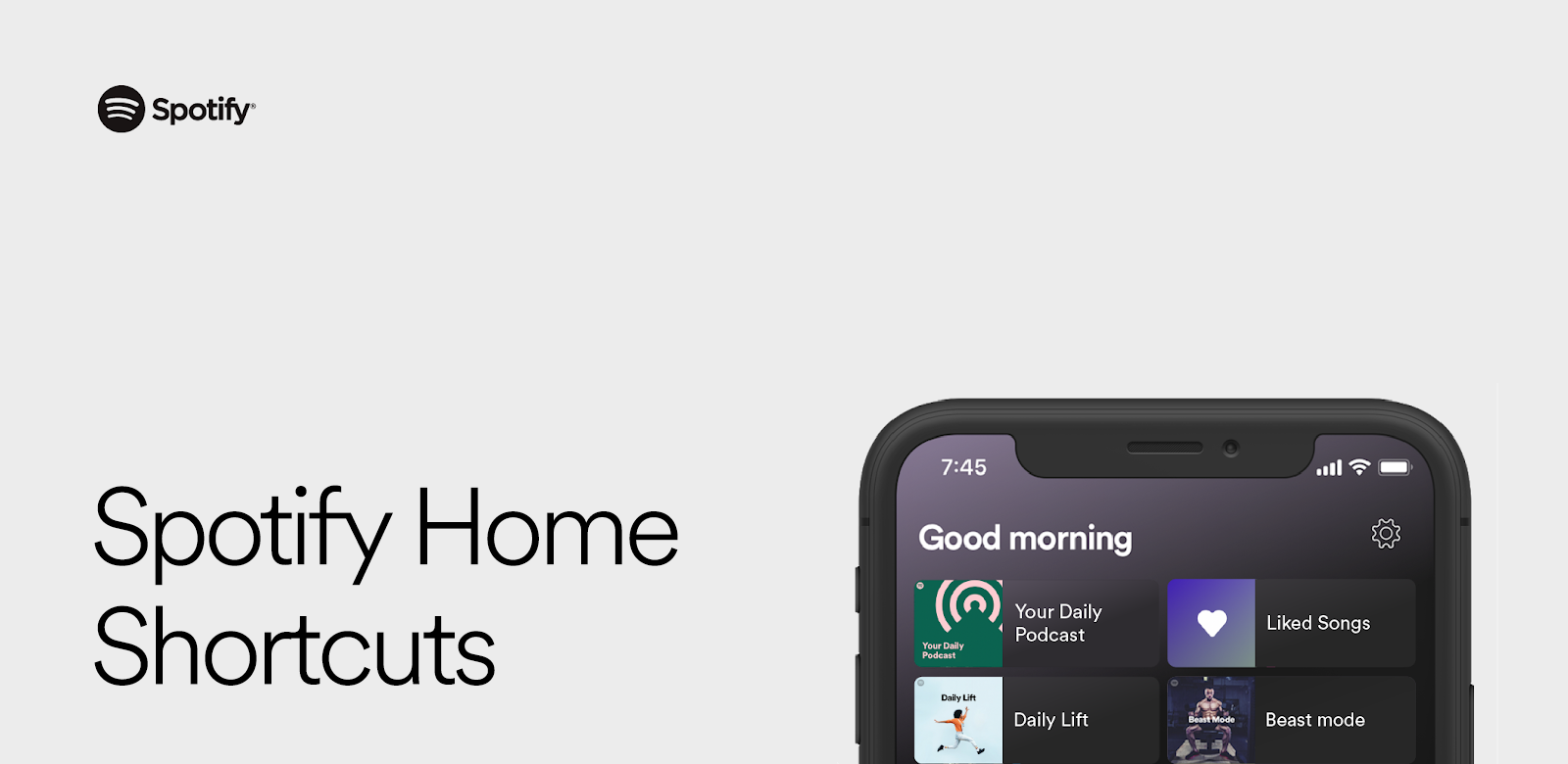
Ever been on Spotify and noticed a section at the top of your homepage showcasing your recent favorites? That's Shortcuts, a pivotal development in Spotify's user experience. Unveiled in 2020, it symbolizes the streaming giant's approach to personalizing music and podcast enjoyment. This section dives into the origins and designs of Shortcuts.
Customization is vital. Spotify has long understood this, with features like Discover Weekly introducing users to new content. Yet, it's just as crucial to have immediate access to familiar tracks. Striking this balance between novelty and nostalgia is at the heart of Spotify's user experience challenge.
Enter Shortcuts. This feature enables listeners to quickly revisit their most played songs and podcasts, epitomizing the concept of putting favorite content at one's fingertips. It occupies a premium spot on the Spotify Homepage, featuring six tiles – or entities – that echo users' listening patterns. The design and subsequent testing aimed to foster trust and predict the next likely plays, making user satisfaction a top priority.
The motivation to develop Shortcuts came from a profound analysis of user behaviors. A week's worth of data showcased that listeners predominantly engage with a limited number of entities, be it albums, personal playlists or Spotify-curated lists. This isn't surprising. Whether it's a newly found track or a timeless favorite, the charm of music lies in its repeatability.
This listener tendency to frequently return to beloved content was the spark that ignited the Shortcuts concept: a dedicated section for quick access to current favorites.
Spotify organizes its Home page into shelves, with each displaying multiple entities. By analyzing shelves like "Recently Played" and "Your Heavy Rotation," the idea was to condense user favorites into the Shortcuts section, efficiently using screen space.
Initially, the team implemented heuristic techniques, which served as a benchmark for comparing future machine learning models. Heuristics, while simple, offered quick iterations, improvements over the existing experience, and clarity in offline evaluations. These evaluations checked if the top six entities in Shortcuts could genuinely represent a user's listening history.
With this foundation, the team ventured into various heuristic iterations, employing different data decay functions and ranking systems based on play frequency and duration. These trials aimed to perfect the heuristic approach through extensive online tests.
However, as heuristic complexity increased, the shift towards a machine learning model became inevitable. Enter the Neural Net, a product of three months of research and over 1,000 trials. By building on heuristic data, the architecture of the neural network achieved a 26.7% improvement in offline evaluations compared to heuristic models. This dual-layered model takes individual play events, combines them for each entity, and then ranks each entity based on the likelihood of being played next.
Before rolling out the feature, it underwent rigorous A/B testing. The overarching hypothesis was that presenting user-favorites right at the top would reduce the effort in seeking desired content. Spotify’s UX team tested and validated this assumption, paving the way for further refinements.
Moving this model into production wasn't without challenges. Monitoring, alerting, and debugging were paramount, given the volume of users' interactions. To preempt potential issues, the team developed tools to monitor feature serving, model outputs and offline metrics.
The Shortcuts journey is emblematic of Spotify's ethos: methodology over mere technology. By delving deep into user data, conducting exhaustive tests and experimenting with heuristics, the team built a robust foundation before employing machine learning. This rigorous process, coupled with cross-functional collaboration, resulted in a feature that enhances user satisfaction, setting Spotify apart in the crowded streaming market.
Learn more about Spotify’s Shortcuts on Spotify's Engineering blog.
It's not enough to just design user interfaces; it's vital to build platforms that foster stories, services and feedback. Airbnb, amid this paradigm shift, stumbled upon a unique observation that emphasized the importance of user research.
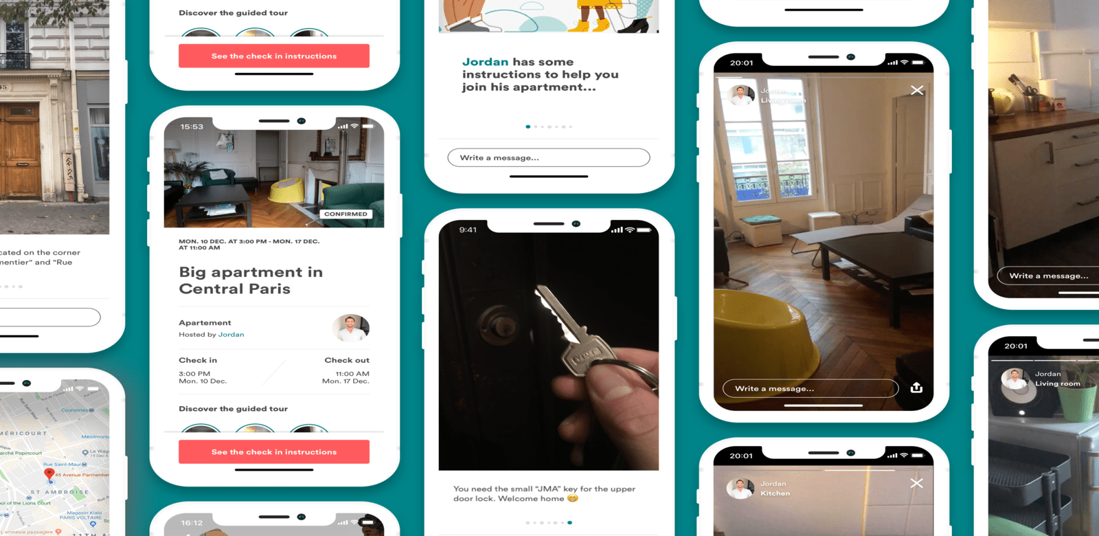
The Host Success team, focused on enhancing both online and offline experiences, observed a distinct pattern: hosts were sending around 1.5 million photo messages weekly to guide guests about their stay. These ranged from photos of homes with overlaid maps to specific instructions for key retrievals. This behavior was diverse, reflecting cultural nuances across the globe. In Tokyo, instructions often started with locating keys from lockboxes in entirely different neighborhoods, while hosts in Delhi used local landmarks as reference points.
Understanding the multifaceted nature of these interactions, Airbnb embarked on a mission to streamline the check-in process. The global check-in tool was designed to support these multifarious interactions while ensuring consistency, offline availability and translation capabilities. This new interface enabled hosts to sequentially add photos, caption them and highlight crucial details, all of which would automatically translate based on the guest's language preference.
After its launch in 2017, the Airbnb team noticed hosts innovatively repurposing the tool. Some illustrated how household appliances worked, while others imported third-party images with lockbox codes. This observation underscored the importance of ongoing user research, even after the launch. Such behavioral insights not only revealed the tool's adaptability but also highlighted areas for further improvement and design evolution.
Airbnb's global check-in tool experience underscores a fundamental design lesson: A product launch isn't the finish line but rather a midpoint. True success lies in observing, understanding, and iterating based on user behavior, ensuring that design solutions evolve in tandem with user needs.
At Hierographx, we often reflect on the transformative journeys of platforms like Airbnb and Spotify to inspire and refine our methodologies. These aren't just case studies to us, but illuminating tales that underscore the invaluable role of meticulous UX research.
As experts in Michigan web design, we pride ourselves on our integration of graphic design expertise and user-centric research. By drawing inspiration from such real-world successes, we continually hone our approaches, ensuring that we remain at the cutting edge of user experience design.
When clients choose Hierographx, they're benefiting from a synthesis of graphic design artistry and precise, data-informed research, all tailored to deliver exceptional digital experiences. At Hierographx, our commitment to our clients combines the finesse of graphic design with the precision of data-driven research, guaranteeing a top-tier digital experience
Discover what truly drives your customers using our comprehensive UX Research service, optimizing your digital touchpoints for maximum engagement.

Discover what truly drives your customers using our comprehensive UX Research service, optimizing your digital touchpoints for maximum engagement.