View
Drag


Gold Hermes Creative Award - Small Business
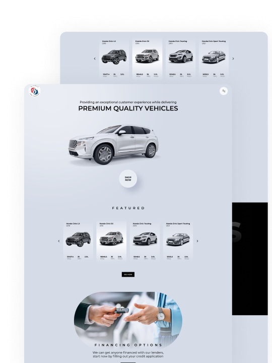
A dated interface, scattered content and lack of visuals left new visitors underwhelmed. As younger audiences looked for shops online and loyal customers expected more digital clarity, the brand needed a modern, user-friendly experience that didn’t lose its small-town roots.


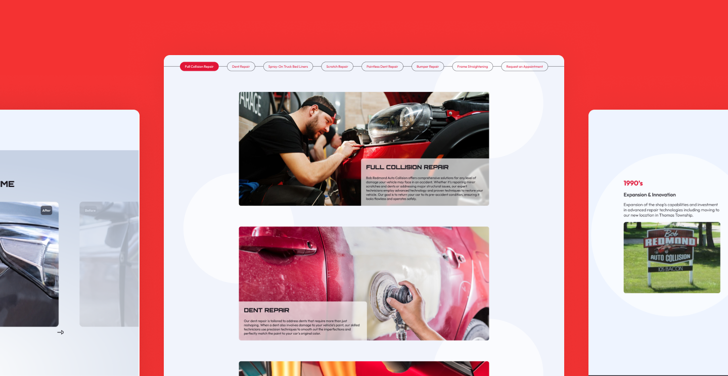
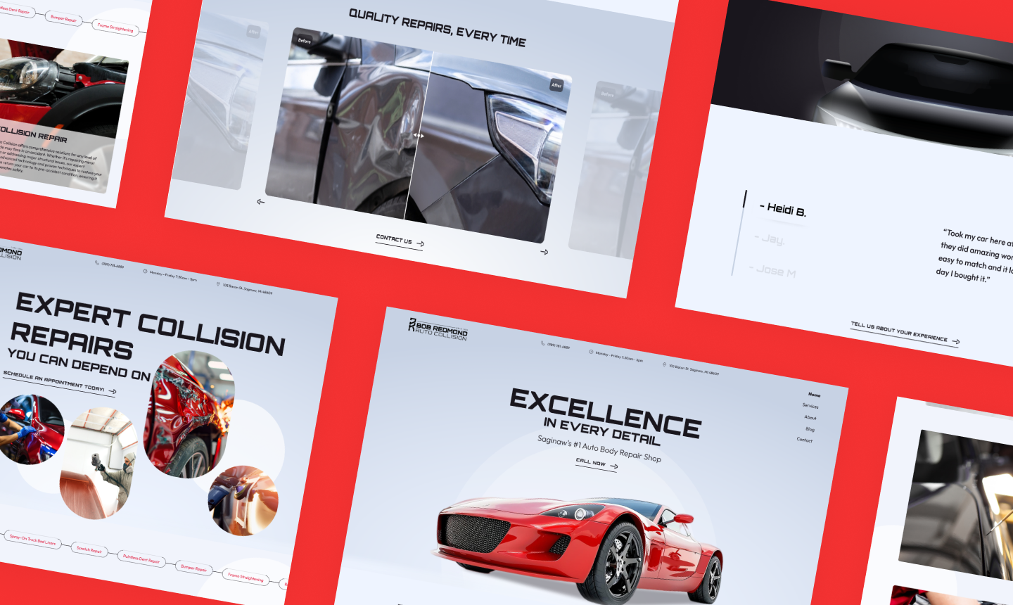
An interactive slider to highlight repair transformations, allowing users to compare damage and results to build trust at a glance.
Quick-click navigation helps users browse services without digging, ideal for customers looking for specifics fast.
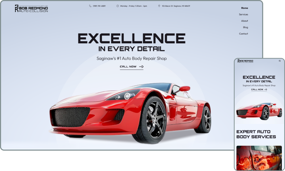
Whether users are booking from the office or scrolling in the driveway, the site performs smoothly on every device.

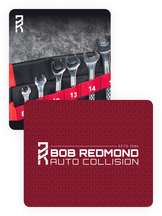
A new logo and color scheme aligned with the company’s values, modernizing the look while preserving the familiar, family-friendly feel.
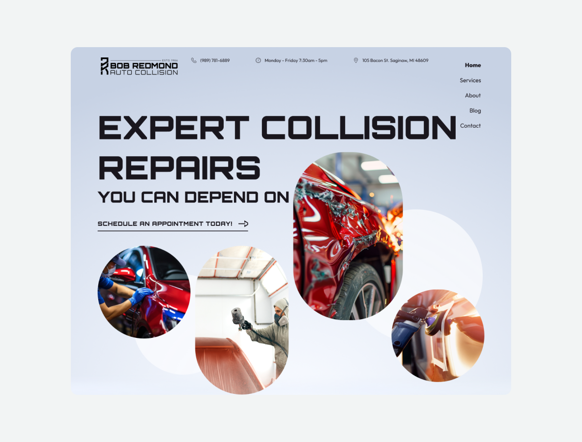
An easy-to-navigate website with clear service descriptions, helping users find what they need without hassle.