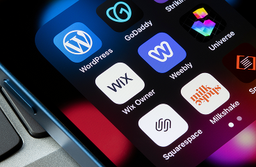
View
Drag


You’ve got visitors. The clicks are happening. The scrolls? Beautiful. But the conversions? Let’s just say they’re not exactly… converting.
If your call-to-action is sitting quietly on your website, hoping someone might notice it, you’ve already lost the game.
CTAs aren’t just buttons. They’re your digital closer. They’re the "let’s make this official" moment. And when done right, they can turn passive lurkers into leads, clients or full-blown brand fans.
So let’s talk about how to make your CTAs actually work and why so many brands (even the ones doing everything else right) get it wrong.
If your CTA says “Unlock the Magic” and your audience has no idea what they’re unlocking… they’re not clicking.
You don’t need to sound like a fantasy novel. You need to sound clear.
Try “Download the Free Guide.” Or “Book a Demo.” Or “Get the Estimate.” Action-oriented, benefit-driven and zero guesswork.
People aren’t reading your button like it’s a riddle - they want to know what happens when they click. And if that’s not instantly obvious? They won’t.
You could write the most compelling, crystal-clear CTA in the world… but if it’s hiding halfway down the page in 12pt font? You’re wasting it.
Put your main CTA above the fold, front and center. No scrolling required. This is the moment where design meets strategy.
Then sprinkle in secondary CTAs throughout the page. One at the end. One after the key sections. Think of them like subtle nudges: “Hey, ready now?”
People skim. People bounce. But the right CTA at the right time? That’s how you catch them before they do.
We’ve said it before and we’ll keep saying it: design matters. A lot.
That button needs contrast. It needs hierarchy. It needs to visually say, “Click me, I’m worth it.”
At Hierographx, a Michigan-based web design company, we constantly run tests for CTA styling because what seems like a small design tweak can have a massive impact on conversions.
Test shapes. Test sizes. Test colors. Don’t assume. Let the data do the talking.
A generic CTA sounds like it was written for the void. A specific CTA? That sounds like it was written for me.
If you’re a Michigan business, speak to other Michigan businesses:
“Get a Quote for Your Michigan Project”
“Start Growing Your Michigan Brand Today”
The more personal your CTA feels, the more likely someone is to act. That’s the beauty of specificity, it builds trust and relevance in one swipe.
We’re not here for clickbait.
But we are here for urgency that actually encourages action. “Limited Time Offer.” “Only 3 Spots Left.” “Get It Before It’s Gone.”
Urgency works when it’s real. When it’s not? It feels manipulative. And that’s a one-way ticket to bounce city.
So yes, nudge your audience to act now. Just don’t fake the deadline. People can tell.
Congrats! Someone clicked. Don’t make them regret it.
Keep forms short. Only ask for what you really need. Use autofill if you can. Consider adding Google or social logins to remove friction.
Complicated = abandoned. Streamlined = success.
Conversion paths should feel smooth, not like a mini obstacle course.
Here’s a common mistake: the CTA promises one thing and the landing page delivers… something else entirely.
If your button says “Get the Free Checklist,” don’t send people to a form asking for their job title, life story and mother’s maiden name.
Follow through on the promise. Match the tone. Match the language. Make the next step feel obvious and expected.
Consistency builds trust. Trust builds conversions. Easy math.
You don’t have to guess which CTA works best, you just have to test it.
Try different colors. Swap out phrases. Move your button up. Change the size. Look at your data.
At Hierographx, we help businesses across Michigan use heatmaps, A/B tests and behavior tracking to figure out what’s actually working and where clicks are falling flat.
Spoiler: Sometimes the tiniest tweak makes the biggest difference.
If your CTAs aren’t converting, it’s not a mystery, it’s a missed opportunity.
Be clear
Be bold
Be strategic
Make it mobile-friendly
Test, refine and repeat
And if you’re tired of guessing, we can help. Whether you’re revamping your website or looking for a smarter Michigan digital marketing strategy, Hierographx has your back, with CTAs that don’t just sit there, but work.
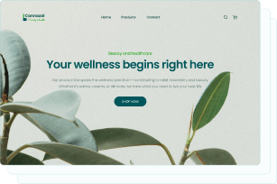
Captivate your audience and enhance brand perception with our custom website design services, creating an unforgettable digital experience.

Captivate your audience and enhance brand perception with our custom website design services, creating an unforgettable digital experience.